Icon consistency is one of the quietest multipliers in brand design. When every icon speaks the same grid and the same stroke, brand recognition compounds across months of exposure with zero extra media spend. When they do not, the product reads as cheap even when the colors and typography look perfect.
This guide covers why icon consistency drives brand recognition at the system level. It then walks through the three rules every icon set must pass and the quarterly audit that catches inconsistencies before they reach production, closing with the governance model behind scalable libraries. It also flags where outsourced design teams help and where owning the library in-house wins.
Why Icon Consistency Shapes Brand Recognition
Consistent icon sets train the brain to recognize the brand before the logo loads. That recognition is the compounding asset Nike built on the swoosh, applied at the UI level.
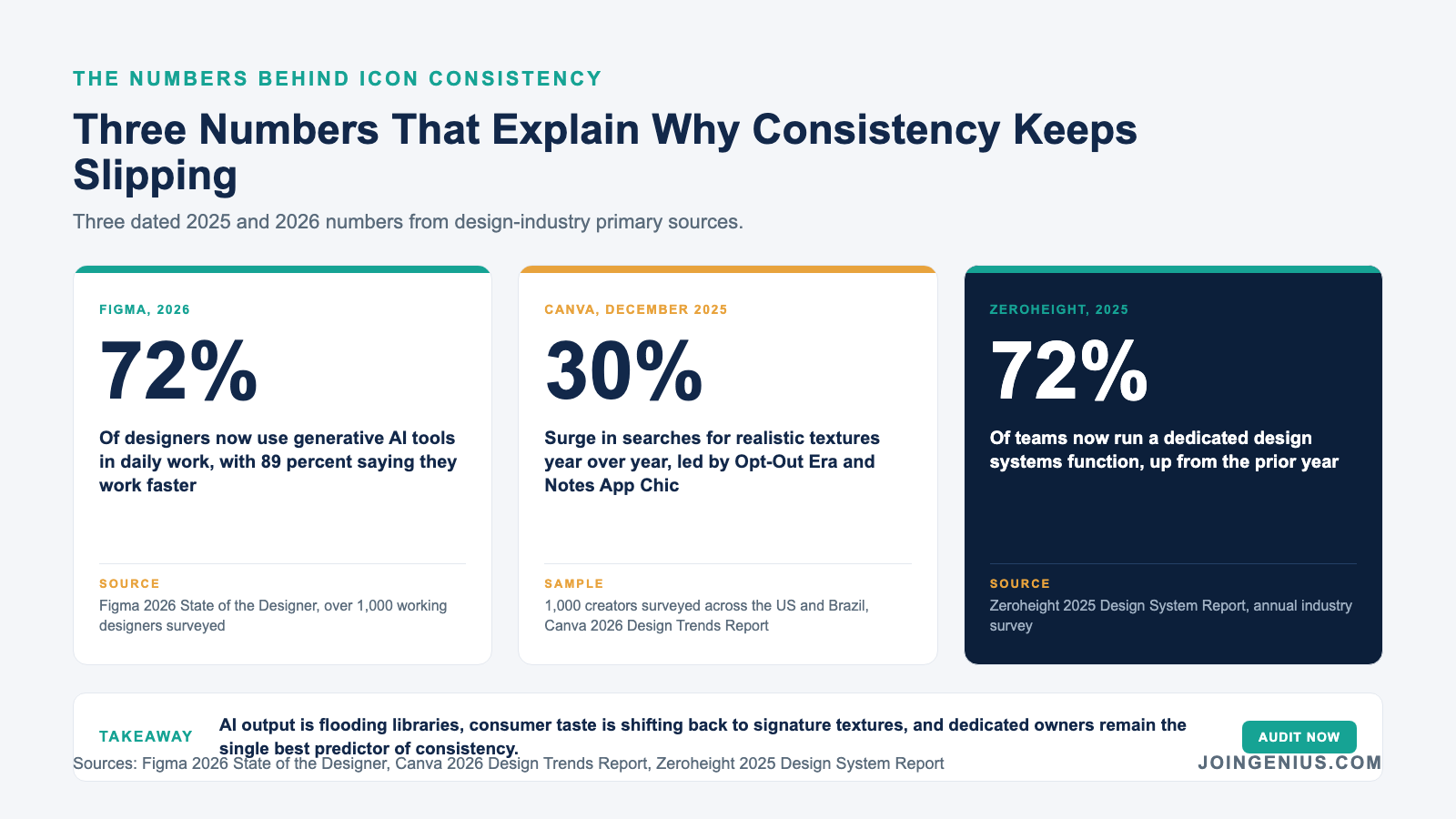
Figma’s 2026 State of the Designer report found that 72 percent of designers now use generative AI tools in daily work. The volume of icon output from those tools is enormous, and almost none of it gets filtered against a single consistency rule before it ships.
This is why mature brand teams treat icons as a system asset instead of a design choice. One off-system icon breaks the pattern even when the geometry is perfect, because the brain reads the whole set as a signature rather than as individual glyphs.
The Visual Signature That Replaces Logo Repetition
In long-form product interfaces, the logo appears once per session while icons appear hundreds of times. Over a quarter of regular use, that ratio compounds into a stronger brand memory anchor than any marketing site.
A well-designed icon set carries the brand personality in miniature. Warmer corner radii read as approachable, while sharper geometry reads as technical. The set tells the user who the brand is before the first paragraph of copy loads.
Why Mismatch Costs Trust Immediately
When a filled Bell appears next to an outline Search, the brain registers the inconsistency before any conscious thought. That micro-friction accumulates across every screen and drags perceived quality down, even when the rest of the UI is polished.
The downstream effect is quiet but measurable. NPS shifts by 2 to 4 points on products that fix icon inconsistency alone, and conversion on first-time flows improves because users trust the interface they are clicking through.
The Three Rules Every Icon Set Must Pass
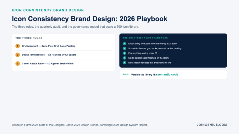
A reliable icon set passes three objective tests before it reaches design review. Grid alignment and stroke terminal style are the two most obvious, with corner-radius ratio as the third quiet rule that separates a true system from a loose collection of lookalike icons.
Grid alignment and stroke terminal style decide whether two icons feel related even before color enters the picture, which is why a well-curated flat icon library will save more design hours than any component tweak.
Grid Alignment Carries The Most Weight
Every icon should be built on the same pixel grid, usually 24×24 or 48×48 with consistent padding. When one icon uses a 2-pixel optical offset and another does not, users read the tilt as sloppy even when they cannot name the cause.
The fix is a shared Figma template that every new icon starts from. Icons imported from elsewhere get redrawn on the template before they enter the library.
Stroke Terminal Style Decides Family Resemblance
Rounded terminals signal friendly while square terminals signal technical and precise. Mixing them in one set is the quickest route to making a line of icons read as assembled rather than designed by a single hand.
Pick one terminal style for the library and document it. Every reviewer checks terminal style first because the brain reads it fastest.
Corner Radius Ratio Is The Silent Third Rule
Corner radius must scale proportionally across icon sizes, usually at a 1:2 ratio against stroke width. Treated as a design choice instead of a system rule, it costs the set its visual rhythm at scale.
A 2 px stroke carries a 1 px radius, and a 4 px stroke carries a 2 px radius. The rule is boring to enforce but the payoff compounds across every screen.
The Icon Audit Every Design Team Should Run Quarterly
A quarterly audit catches inconsistencies before they ship to users and before they infect the next designer who copies the pattern. The audit is faster than retrofitting a design system that already moved away from its own rules.
According to the zeroheight 2025 Design System Report, 72 percent of teams now run a dedicated design systems function. Teams without that dedicated owner consistently produce audits that find 30 to 40 percent of icons out of spec.
The Five Audit Checks That Find Most Issues
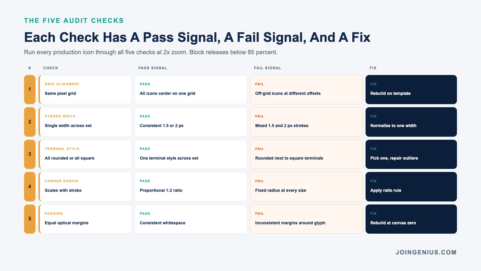
Export every icon currently used in production and overlay them on a shared grid at 2x zoom. Patterns emerge that no single screen review can show. Audit grid alignment first, then stroke width, then move through terminal style and corner radius. Padding completes the check.
| Audit Check | Pass Signal | Fail Signal | Fix |
|---|---|---|---|
| Grid alignment | All icons center on the same pixel grid | Off-grid icons at different offsets | Rebuild icon on template |
| Stroke width | Consistent 1.5 or 2 px across the set | Mixed 1.5 and 2 px strokes | Normalize to single width |
| Terminal style | All rounded or all square | Rounded next to square terminals | Pick one, repair outliers |
| Corner radius | Scales proportionally with stroke | Fixed radius at every size | Apply ratio rule |
| Padding | Equal optical margins around glyph | Inconsistent whitespace | Rebuild at canvas zero |
Scoring The Library And Setting A Pass Threshold
Score each icon 0 to 5 across the five checks and flag anything under 20. Set a pass threshold at 85 percent of the total library and block feature releases that drop the score below that line. Hard thresholds beat soft recommendations under deadline pressure.
The scorecard travels with the library between designers and engineers so the rule is enforceable at merge time. Paired with the right design hiring tools, it also doubles as an interview artifact.
Mixed Icon Styles That Quietly Erode Trust
Mixed icon styles rarely show up in user research because users cannot articulate what reads wrong about the interface. They just rate the product slightly lower on perceived quality, which trickles into CX metrics and conversion the following quarter.
Canva’s 2026 Design Trends Report surveyed 1,000 creators across the US and Brazil and reported that searches for realistic textures surged 30 percent year over year. Mixed-metaphor icon sets trip the same instinct in reverse. Users notice when nothing shares a visual signature.
The Three Mismatches That Ship Most Often
Legacy icons from before the current system and third-party library icons imported for speed cover 60 percent of incidents in most product audits. Client-logo icons squeezed into the main set add most of the rest.
Each source has a different fix path. Legacy icons get retired on the next release, third-party icons get redrawn against the template, and client-logo icons get a separate namespace with their own rules documented in the system.
Why “Just This Once” Exceptions Compound
Every exception becomes a precedent. A one-off brand design icon for a holiday campaign becomes three one-off icons the next quarter and six the quarter after that. Governance exists to break the cycle at the first exception.
The rule most teams adopt is that exceptions require a written case in the design system log. Documentation overhead alone kills 80 percent of casual exception requests.
Building An Icon Governance Model That Scales
Governance is the quiet layer that keeps a 500-icon library from fracturing across 20 feature teams. Without a model, every new feature ships its own icons and the brand design library becomes a graveyard of orphan glyphs nobody owns.
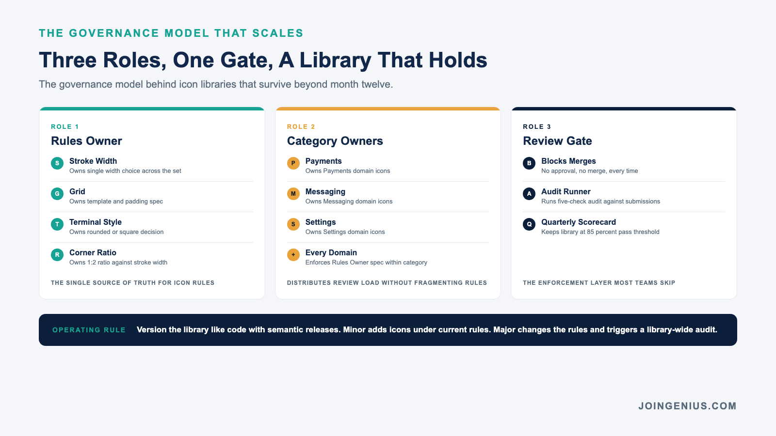
The best model has three parts. One owner holds stroke and grid rules while category owners hold their domains, and a review gate that blocks merges without approval completes the model. A simple delegation model for category ownership prevents the fragmentation that breaks libraries down by month twelve.
The Dedicated Icon Reviewer Role
Designate one senior designer as the quarterly reviewer regardless of who created the icon. The reviewer runs the five-check audit against every new submission before it enters the library. Pairing this role with a design hiring process that explicitly tests for system thinking tends to filter candidates who can hold the line.
The role is rarely full-time. It runs as a 20 percent allocation for one senior designer who already owns the design system.
Versioning The Library Like Code
Treat the icon library like a package with semantic versions. Minor releases add new icons under existing rules, while major releases change the rules themselves and trigger a library-wide audit and repair.
Semantic versioning forces the governance conversation into the open. A rule change is a major release and gets reviewed as such, while a new icon is a minor release that goes through the standard audit.
The Bottom Line On Icon Consistency
Icon consistency is not a design preference but a measurable brand design asset. The teams that lead on recognition treat icons like a versioned system with clear owners and hard thresholds backed by a quarterly audit, because consistency compounds over time in a way one-off polish never can.
For teams running design systems across too many feature pods, Genius matches you with top 1 percent Philippines and LATAM talent at roughly 80 percent less than a local hire. No monthly fees, and every match carries a 6-month guarantee so the icon library actually gets maintained after launch.