Most product design teams have made this hire at least once. The portfolio was gorgeous, with rich gradients and a brand system that looked expensive. Three months in, the new designer shipped a settings page with error text below contrast minimums and eleven near-identical grays. The panel never tested for color-theory intuition, because the portfolio seemed to prove it.
A portfolio shows finished work, and a brand team or an AI tool may have chosen half its colors. This post covers what color judgment looks like and why portfolio review misses it. It also covers the live exercise that replaces portfolio gatekeeping and the 90-day check that confirms the hire.
Why A Strong Portfolio Hides Weak Color Judgment
A portfolio is a record of outcomes, and color judgment is a chain of decisions. Almost none of those decisions make it into a case study.
Start with who picked the palette. On most in-house work, the brand colors came from inherited guidelines, and the product palette came from someone else’s design system. The case study shows the candidate applying those colors well, not whether they could have built them.
Then look at which screens made the cut. Portfolios favor hero screens and onboarding flows. The screens that test color judgment are the unglamorous ones, such as dense data tables and disabled states. Dark mode and chart palettes almost never appear, and that is where most palettes break.
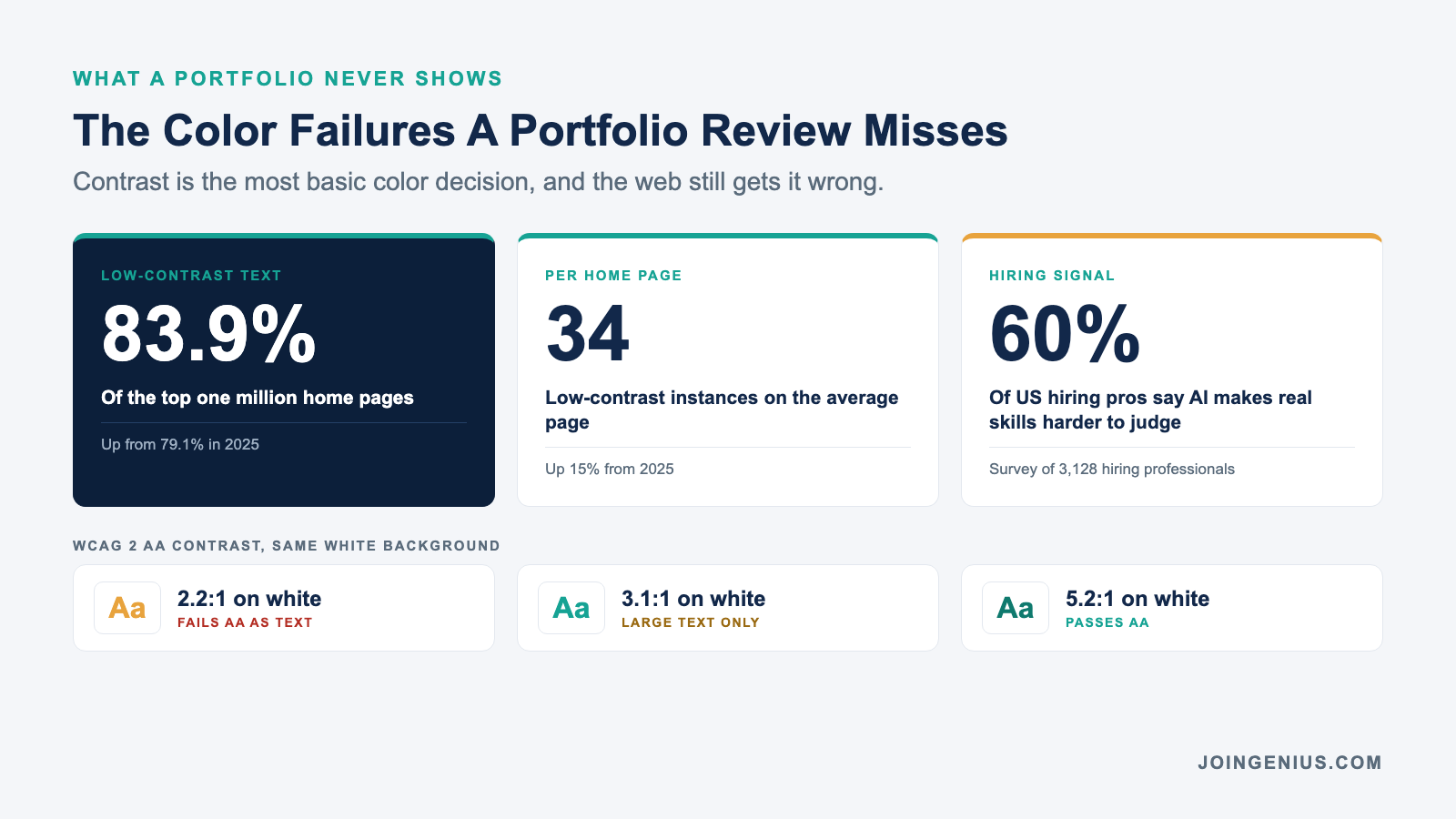
AI has made the gap wider. Plenty of teams now want AI-fluent designers, which also means more portfolio work is produced with AI help. In Western Governors University’s 2026 Workforce Decoded report, 60 percent of 3,128 US hiring professionals said AI is making it harder to evaluate candidates’ real skills.
The cost shows up after launch. The 2026 WebAIM Million report found low-contrast text on 83.9 percent of the top one million home pages, up from 79.1 percent in 2025. It was the most common accessibility failure, with 34 distinct instances on the average home page.
Contrast is the most basic color decision there is, and no portfolio review tells you which candidate gets it right.
What Color-Theory Intuition Looks Like On A Product Team
Color-theory intuition is not taste, and it is not a memorized color wheel. It is the ability to predict how a color decision will behave before anyone builds the screen.
On a product team it shows up as five habits, each with a red flag that is just as easy to spot.
| Signal | What A Strong Designer Does | Red Flag |
|---|---|---|
| Value first | Sets the lightness structure before choosing hues | Picks the hue first and fixes lightness by eye |
| Contrast prediction | Knows whether a pair clears 4.5:1 before checking | Finds failures only when a checker flags them |
| Even shade steps | Changes lightness by the same amount at every step | Mixes in black, so the dark steps jump unevenly |
| One job per color | Gives each color a single meaning | Uses the brand color for links and alerts |
| Context shifts | Rebuilds the palette for dark mode and charts | Inverts the light theme and calls it dark mode |
Even steps are harder than they look. HSL, a color model nearly every design tool supports, treats yellow and blue at 50 percent lightness as equal. Your eye sees the yellow as far lighter. A designer with real intuition either works in a perceptual model like OKLCH or corrects for it by hand.
The contrast thresholds are fixed. WCAG 2 AA requires 4.5:1 for normal-size text and 3:1 for large text and interface components. Strong designers can tell a pair will fail before the checker does, while weak ones wait for QA.
The Live Palette Exercise That Replaces The Portfolio Walkthrough
The most direct way to see these habits is to watch someone build a palette from scratch. Forty-five minutes with one brand color tells a panel more than an hour of case-study slides.
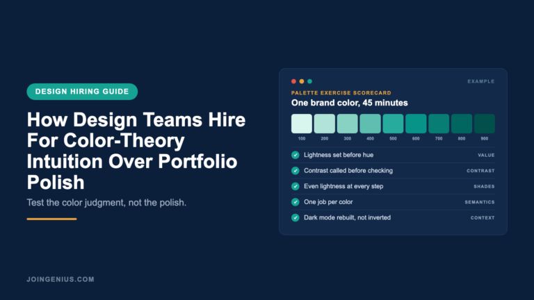
Give the candidate a single brand color, ideally your own. Ask for a nine-step shade scale for that color and a matching neutral scale. Then ask for success and danger colors that work as text on white, plus a dark mode version of one card and one alert. Allow 30 minutes to build and 15 to explain.
Run it in a tool that shows its work. A color palette generator like Atmos builds shade scales in OKLCH and checks contrast while the candidate works. The panel can watch each lightness value change, so the conversation is about why a step moved, not whether the final export looks nice.
Score the narration, not the output. Three questions do most of the work. Why did you pick that step as the base? Which pair here fails for someone with red-green color blindness? What breaks if the brand hue shifts ten degrees next year?
Work samples like this are now mainstream. TestGorilla’s State of Skills-Based Hiring 2025 found that 76 percent of employers use skills tests, and two in three say the tests have reduced their mis-hires. TestGorilla sells skills tests, so read those figures with that in mind.
The Same Two Finalists, Scored Two Ways
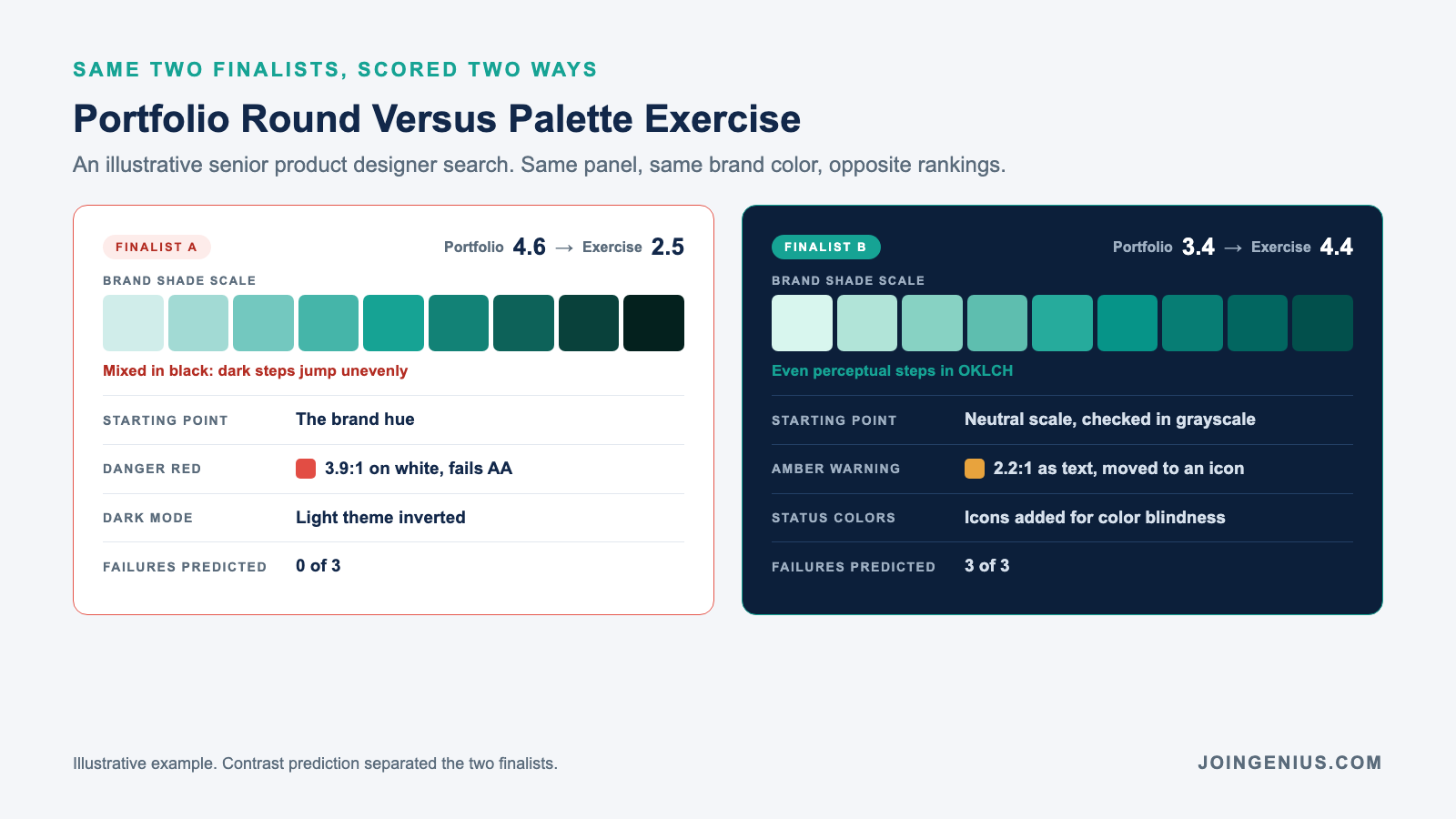
Here is an illustrative example from a senior product designer search. The panel saw the same two finalists twice and ranked them in opposite order.
In the portfolio round, Finalist A was the clear favorite, with a fintech rebrand built around a striking violet palette. Finalist B showed mostly B2B dashboards and admin tools, clean but plain. The panel scored A at 4.6 out of 5 and B at 3.4.
The palette exercise reversed it. Finalist A started from the brand hue and built the darker shades by mixing in black. Each dark step jumped further than the last, and the 900 step came out nearly black. The danger red tested at 3.9:1 on white, and dark mode was the light theme inverted.
Finalist B built the neutral scale first and checked the hierarchy in grayscale before adding any hue. B then built the brand scale in even perceptual steps. Before checking anything, B predicted the amber warning would fail as text and moved it to an icon beside dark text.
B also flagged that success green and danger red would look alike to users with red-green color blindness, then added icons to both. Exercise scores came back at 2.5 for A and 4.4 for B, and the team hired B.
The signal that separated them was contrast prediction, the most testable part of color-theory intuition. B called three failures before the checker did. A found none until the panel pointed at them.
A Four-Stage Hiring Loop For Color-Theory Intuition
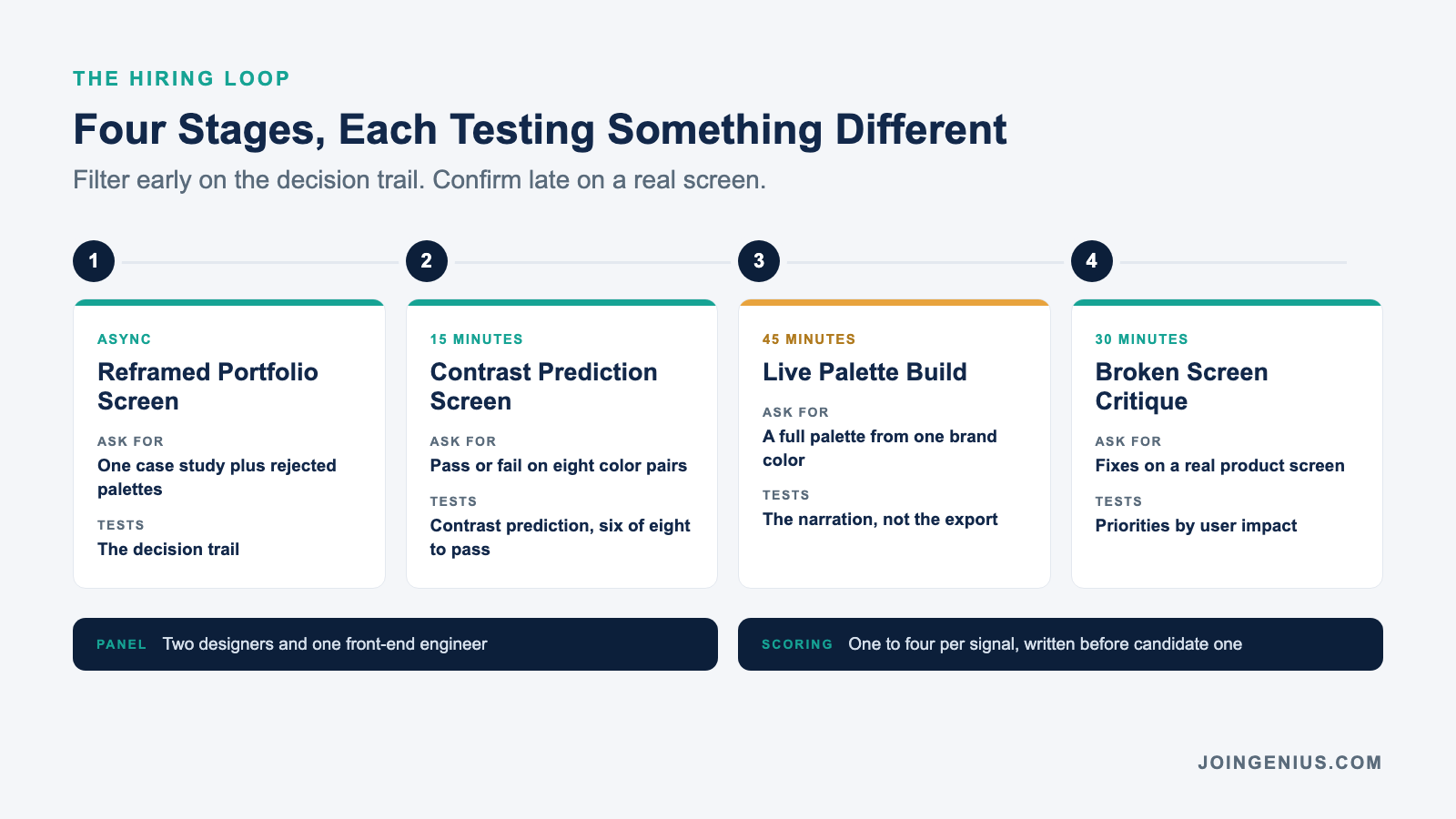
The exercise works best inside a loop that filters early and confirms late. Each stage tests something the others cannot.
Stage one is a reframed portfolio screen. Ask for one case study plus the palettes the candidate rejected and why. You are screening for a decision trail, so plain work with a clear rationale beats polish with no explanation.
Stage two is a 15-minute contrast screen. Show eight color pairs and ask which pass AA as normal-size text, then check them together. Strong candidates get six or more right without a checker. Weak ones tend to overrate saturated pairs, like orange text on white.
Stage three is the 45-minute palette build described above. Stage four is a 30-minute critique of a real screen from your product with known color problems, such as placeholder text below 4.5:1 or status chips that rely on red versus green alone. Ask the candidate to rank the fixes by user impact, not by effort.
Put two designers and one front-end engineer on the panel, since the engineer will turn the palette into tokens. Score each stage from one to four per signal, and write those anchors into your interview rubric before the first candidate arrives.
The 90-Day Check That Confirms The Hire
A hiring signal is only worth keeping if it predicts the job. Ninety days in, three numbers tell you whether the color-theory intuition you hired for made it into shipped work.
Number one is new contrast failures. Run an automated checker on every screen the hire shipped and count the new AA failures, aiming for zero. Number two is one-off colors, meaning new hex values added outside the token set. A strong hire proposes a new token instead of adding a stray hex.
Number three is palette rework. Count how often engineering or brand sent a color decision back. Two or more in a quarter means the loop missed something, so tighten the stage that should have flagged it.
For a junior hire, pair these numbers with weekly color critique. Formal mentorship programs rarely move junior designers on their own, and color instinct grows fastest with specific feedback on shipped screens.
Hire Designers Who Can Defend Every Color
Stop asking the portfolio to answer a question it was never built for. Use it to decide who gets the exercise, then make the offer on what you watched. Color-theory intuition shows in how a designer explains a scale, and that explanation is what your engineers will rely on for years.
Genius hires top 1 percent product and UI designers from the Philippines and Latin America at roughly 80 percent less than local salaries. There are no monthly fees, and every placement comes with a six-month talent guarantee.
We can run the contrast screen and palette exercise from this post before any designer reaches your panel. The finalists you meet will have already shown their color judgment, not just their best screens.